Accessible to operate
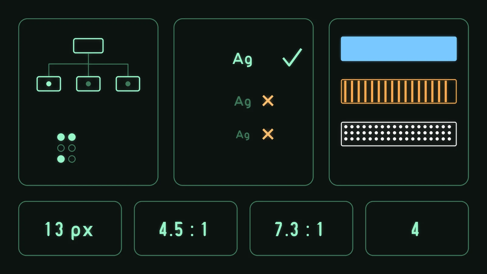
PSOrvia gives screen readers a complete access tree, keeps type at 13 px or more and shows levels in a way that stays readable with colour-vision deficiency.
Framework Quality
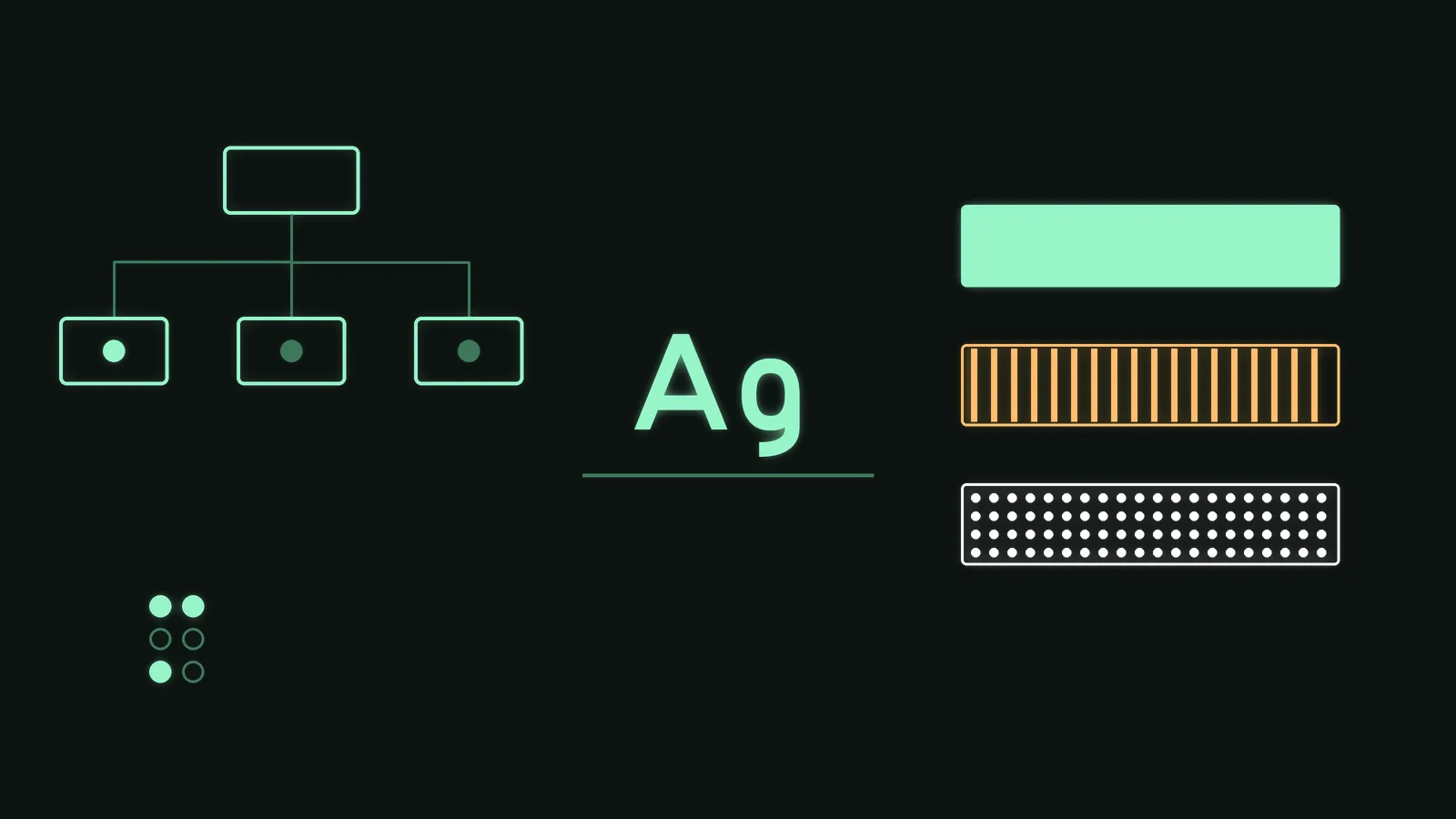
Every interface PSOrvia draws reports its elements to the system with role, name, value and value range. On Linux this is checked through AT-SPI: a test run reads the tree of two windows, finds roles, names and values correct, and moves a slider and a switch through the screen-reader interface. In addition there are 15 checks for usable, unambiguous names and 23 for displays that move by themselves and must not be read out all the time. Braille displays are connected through BRLTTY (42 checks). The bridges for Windows, macOS and iOS are written; they have not yet been checked there with real screen readers.
Type and input: the house typeface never drops below 13 px and is never squeezed; text that is too long counts as a layout error. Text fields can be operated from the keyboard (selecting, cut and paste, line start and end); 42 checks run green.
Colour: level displays have 4 colour schemes for three kinds of colour-vision deficiency and for high contrast. The worst measured contrast is 4.5 : 1, the high-contrast set reaches 7.3 : 1. Patterns and tick marks also carry the zones, so they can be told apart without colour. 32 measurements stay inside their limits.